tskeeter
Junior Associate
Joined: Mar 20, 2011 19:37:45 GMT -5
Posts: 6,831
|
Post by tskeeter on Sept 29, 2013 11:12:30 GMT -5
I like 1,3,4,7, and 10.
#1 - could sense of drama be raised by cropping just a bit?
#4 - I like the contrast in the lighting between the dark canyon and the light sky. Makes the image a little dark and forboding. Also seems to carry the message that when the world seems to be closing in, there is light (better days) on the horizon.
#7 - Crop to show flower, rock, and lichen and less of the background foliage to highlight the flower?
#10 - I prefer 10 over 11 because the tree screening the sky line in the right of the photo creates a sense of intimacy that is not present in the more panaramic view in #11.
Now that I see the views you re-worked a bit, I do like them better. I agree that the revised view in #1 might be a little over cropped. And maybe, just a very little bit on #7, too. (I feeling like I'd like to see some more rock below the lichen at the bottom of the picture to give a sense of a foundation for the view.) And I agree with your choice to reduce the brightness in #11. I think the lighting change changes the feel of the picture.
I find that by cropping my photo's I can often significantly improve the composition of the view, making splotches of color more prominent, creating more depth and scale by reducing the amount of background that distracts from the foreground and midground in the photo, etc. Maybe I just don't do a very good job of composing photos through the view finder and that's why I find the ability to crop a photo so helpful.
I like Apple's lighting, but I find that adjusting the lighting in some of my own photos has turned a piece of garbage into something pretty interesting. I had a photo of a watch tower on the ancient town wall of Beaune, France, which was taken in the early afternoon (poor lighting). The photo was too dark. Half was almost black from the deep shadows cast by some large trees. By adjusting the lighting (brightness) I was able to highlight the joints in the stone work of the wall and make the shadow less daunting. I also found that if I brought in too much light, a house in the background of the picture became quite prominent. To the point where the house almost became the focus of the picture rather than the architecture of the watch tower and the masonry work of the wall.
Lots of source material (about 900 photos from two weeks in France) and some judicious photo editing can make even a hack photographer, like me, look like I'm Ansel Adams or James Brady. Most people only see the couple of dozen edited photos from the France trip that turned out pretty well. They don't see the hundred of photos that didn't make the cut.
Apple, another source of great landscape material not too far from you is Silver Falls State Park, near Salem. Not only is it cool to walk down the trail and behind the falls, but picture taking in the falls area and the gorge can be spectacular. On the wall of my office I keep a picture of the falls famed by some moss covered trees along the path. I like the verticality that the falls and the trees project. (I did a little cropping and had the photo printed portrait orientation, rather than landscape, to emphasize the vertical scale.) The verticality is contrasted by a horizontal wood fence along the path, which anchors the bottom foreground of the picture. And the fact that the photo was taken from below the lip of the falls makes the water seem to appear out of no where.
In the winter, breezes up the gorge can create clouds of spray, mist, and fog where the water comes over the lip. If a person could get the timing right, you might be able to get a photo where the water appears to fall out of a cloud that is bracketed by the pine trees at the top of the falls. I think that could provide kind of a surreal image that might challenge your sense of where up and down are.
|
|
Virgil Showlion
Distinguished Associate
Moderator
[b]leones potest resistere[/b]
Joined: Dec 20, 2010 15:19:33 GMT -5
Posts: 27,448 
|
Post by Virgil Showlion on Sept 29, 2013 11:24:44 GMT -5
1, 3, 4, 7, 11. The reworked versions are improvements in all but the case of the flower, but don't change my picks. 3 and 4 are underexposed, but it gives them a nice old world quality. If you enhanced the contrast on 3 artificially, perhaps reduce it a bit. It's a bit specky. Very nice work overall.  |
|
Peace Of Mind
Senior Associate
[font color="#8f2520"]~ Drinks Well With Others ~[/font]
Joined: Dec 17, 2010 16:53:02 GMT -5
Posts: 15,554  Location: Paradise
|
Post by Peace Of Mind on Sept 29, 2013 15:43:11 GMT -5
Dang those are beautiful! My favorites in order: #1 - The first one though. The cropped one is nice too but the Wow! factor to me is in #1 #3 #4 or #5 but if I had to choose I'd pick #4 because it looks like the moon is reflecting on the water. But since it's still light out I'm not sure if that makes sense.  #9 #10 Disclaimer: I have good taste but don't know shit about photography. But I know what I'd buy and what I won't.  |
|
ՏՇԾԵԵʅՏɧ_LԹՏՏʅҼ
Community Leader
♡ ♡ BᏋՆᎥᏋᏉᏋ ♡ ♡
Joined: Dec 17, 2010 16:12:51 GMT -5
Posts: 43,130
Location: Inside POM's Head
Favorite Drink: Chilled White Zin
|
Post by ՏՇԾԵԵʅՏɧ_LԹՏՏʅҼ on Sept 29, 2013 15:52:16 GMT -5
1
6
9
10
11
|
|
Virgil Showlion
Distinguished Associate
Moderator
[b]leones potest resistere[/b]
Joined: Dec 20, 2010 15:19:33 GMT -5
Posts: 27,448
|
Post by Virgil Showlion on Sept 29, 2013 17:54:37 GMT -5
I added a poll to the OP and imported the cropped alternates from one of Apple's later posts so that all were viewable in one post. Only the Proboards "add poll" feature apparently didn't add one, despite claiming it did. Hence my apologies, apple. I did my best.  |
|
Apple
Junior Associate
Always travel with a sense of humor
Joined: Dec 17, 2010 15:51:04 GMT -5
Posts: 9,938
Mini-Profile Name Color: dc0e29
|
Post by Apple on Sept 29, 2013 19:50:42 GMT -5
I added a poll to the OP and imported the cropped alternates from one of Apple's later posts so that all were viewable in one post. Only the Proboards "add poll" feature apparently didn't add one, despite claiming it did. Hence my apologies, apple. I did my best. I appreciate the effort I was going to put the cropped pictures in the OP yesterday afternoon, but ran out of steam for doing anything after I had to dig the second grave of the year So, thanks for doing that for me |
|
Apple
Junior Associate
Always travel with a sense of humor
Joined: Dec 17, 2010 15:51:04 GMT -5
Posts: 9,938
Mini-Profile Name Color: dc0e29
|
Post by Apple on Sept 29, 2013 20:04:18 GMT -5
What is the goal for this assignment? Something artsy, or something beautiful? I ask because while 4 isn't the most beautiful, I find it spooky. When I get a strong feeling like that, I think art. True art, for me, captures a feeling. I also really like the first 3 reworked pics. The mountain looks like its smoking, which seems cool to me. The goal is just to get us out there using our cameras! The end result can be how we like it. I like "unworked" photos best, so what you download is what you get, but completely see the need for cropping when you just can't physically get yourself in a position to remove the "undesirables". I want to get good enough with my camera that I don't need software to do any touching up (although, I admit that can do a lot of great things too). There is something about 4 that draws me in too. I know it's a little dark, but, like someone said earlier, it has a little spooky feel to it. I love spooky. There are some photos that are "technically" perfect, and I've seen some get judged now, and I just don't see what the judges do sometimes. I need to do for me what I think is pretty, but then, if I decide to enter a competition, be able to give what they want to see while judging. I think it would be nice if I can make a picture that does both. |
|
Opti
Community Leader
Joined: Dec 18, 2010 10:45:38 GMT -5
Posts: 42,242
Location: New Jersey
Mini-Profile Name Color: c28523
Mini-Profile Text Color: 990033
|
Post by Opti on Sept 29, 2013 20:09:20 GMT -5
I like the original #1 over the cropped and #3.
I liked the one with the flower, but since I don't see them
side by side, not sure which I'd pick. Not sure if it matters. The best thing about that
pic is it shows your ability to look at small pieces of landscapes versus the rest of
your pics which fall in the traditional scope of landscapes only being large areas.
There's one with a stairway I like except the cutoff tree on the left bothers me.
It gives it a nice darkness, but I'd probably cut it entirely out or just leave a hint of it
there. I keep wanting to see what the tree looks like and some of its leaves. The cutoff nature of it feels discordant to me.
|
|
Apple
Junior Associate
Always travel with a sense of humor
Joined: Dec 17, 2010 15:51:04 GMT -5
Posts: 9,938
Mini-Profile Name Color: dc0e29
|
Post by Apple on Sept 29, 2013 20:11:01 GMT -5
I like 1,3,4,7, and 10. #1 - could sense of drama be raised by cropping just a bit? #4 - I like the contrast in the lighting between the dark canyon and the light sky. Makes the image a little dark and forboding. Also seems to carry the message that when the world seems to be closing in, there is light (better days) on the horizon. #7 - Crop to show flower, rock, and lichen and less of the background foliage to highlight the flower? #10 - I prefer 10 over 11 because the tree screening the sky line in the right of the photo creates a sense of intimacy that is not present in the more panaramic view in #11. Now that I see the views you re-worked a bit, I do like them better. I agree that the revised view in #1 might be a little over cropped. And maybe, just a very little bit on #7, too. (I feeling like I'd like to see some more rock below the lichen at the bottom of the picture to give a sense of a foundation for the view.) And I agree with your choice to reduce the brightness in #11. I think the lighting change changes the feel of the picture. I find that by cropping my photo's I can often significantly improve the composition of the view, making splotches of color more prominent, creating more depth and scale by reducing the amount of background that distracts from the foreground and midground in the photo, etc. Maybe I just don't do a very good job of composing photos through the view finder and that's why I find the ability to crop a photo so helpful. I like Apple's lighting, but I find that adjusting the lighting in some of my own photos has turned a piece of garbage into something pretty interesting. I had a photo of a watch tower on the ancient town wall of Beaune, France, which was taken in the early afternoon (poor lighting). The photo was too dark. Half was almost black from the deep shadows cast by some large trees. By adjusting the lighting (brightness) I was able to highlight the joints in the stone work of the wall and make the shadow less daunting. I also found that if I brought in too much light, a house in the background of the picture became quite prominent. To the point where the house almost became the focus of the picture rather than the architecture of the watch tower and the masonry work of the wall. Lots of source material (about 900 photos from two weeks in France) and some judicious photo editing can make even a hack photographer, like me, look like I'm Ansel Adams or James Brady. Most people only see the couple of dozen edited photos from the France trip that turned out pretty well. They don't see the hundred of photos that didn't make the cut. Apple, another source of great landscape material not too far from you is Silver Falls State Park, near Salem. Not only is it cool to walk down the trail and behind the falls, but picture taking in the falls area and the gorge can be spectacular. On the wall of my office I keep a picture of the falls famed by some moss covered trees along the path. I like the verticality that the falls and the trees project. (I did a little cropping and had the photo printed portrait orientation, rather than landscape, to emphasize the vertical scale.) The verticality is contrasted by a horizontal wood fence along the path, which anchors the bottom foreground of the picture. And the fact that the photo was taken from below the lip of the falls makes the water seem to appear out of no where. In the winter, breezes up the gorge can create clouds of spray, mist, and fog where the water comes over the lip. If a person could get the timing right, you might be able to get a photo where the water appears to fall out of a cloud that is bracketed by the pine trees at the top of the falls. I think that could provide kind of a surreal image that might challenge your sense of where up and down are. #1... Yeah, I think I overcropped. I'm going to try again cropping just a little from the top because it just seems too heavy to me, but not go overboard. #4 I am glad someone else sees what I see in this photo I think it's almost disturbingly beautiful. #7... Well, turns out this one is out either way... I looked at our homework assignments again for the course, and we do close-ups later. Because I did it DURING the class, I feel ok using it later if I want Thanks for the tip about Silver Falls, I'm always looking for new ones. I have a pretty photograph taken from behind Ponytail Falls in the Gorge, but, it was taken before the class and so it's "not fair". I'm really looking forward to getting better at this. One awesome thing with digital is that I can take all those not-so-great ones and not waste money developing them. I can also feel safe practicing technique a LOT and not feel I'm being wasteful. |
|
Apple
Junior Associate
Always travel with a sense of humor
Joined: Dec 17, 2010 15:51:04 GMT -5
Posts: 9,938
Mini-Profile Name Color: dc0e29
|
Post by Apple on Sept 29, 2013 20:14:08 GMT -5
1, 3, 4, 7, 11. The reworked versions are improvements in all but the case of the flower, but don't change my picks. 3 and 4 are underexposed, but it gives them a nice old world quality. If you enhanced the contrast on 3 artificially, perhaps reduce it a bit. It's a bit specky. Very nice work overall. #3 doesn't look near as "specky" in the original, so looks like some of that happened when I changed file size. I'm going to resave it from the original and see if I can get that to go away, blur it back to match the original if I have to. It's prettier in full size (but full size is about 8Mb and I have to send it to the instructor as 230kb max). Thanks for pointing that out. |
|
Apple
Junior Associate
Always travel with a sense of humor
Joined: Dec 17, 2010 15:51:04 GMT -5
Posts: 9,938
Mini-Profile Name Color: dc0e29
|
Post by Apple on Sept 29, 2013 20:16:28 GMT -5
Dang those are beautiful! My favorites in order: #1 - The first one though. The cropped one is nice too but the Wow! factor to me is in #1 #3 #4 or #5 but if I had to choose I'd pick #4 because it looks like the moon is reflecting on the water. But since it's still light out I'm not sure if that makes sense. #9 #10 Disclaimer: I have good taste but don't know shit about photography. But I know what I'd buy and what I won't. Thank you When I watch judging, I feel like I don't know much about it either, but sometimes I pick the photo the judges do. If I use #1, I'll use the original or just a very slightly cropped one (just to lighten a little off the top). Have to keep the wow factor I was actually afraid no one would like this one, but seems to be a pretty consistent choice! |
|
Apple
Junior Associate
Always travel with a sense of humor
Joined: Dec 17, 2010 15:51:04 GMT -5
Posts: 9,938
Mini-Profile Name Color: dc0e29
|
Post by Apple on Sept 29, 2013 20:18:13 GMT -5
Thanks I'm a little afraid to use both waterfalls because I want to show more variety, but it's so hard for me to pick between them! |
|
Apple
Junior Associate
Always travel with a sense of humor
Joined: Dec 17, 2010 15:51:04 GMT -5
Posts: 9,938
Mini-Profile Name Color: dc0e29
|
Post by Apple on Sept 29, 2013 20:19:27 GMT -5
I liked 3, 5, and 10 the best. Haha! I think this would be easier if I could only pick two or three, but five makes the choices harder... |
|
Apple
Junior Associate
Always travel with a sense of humor
Joined: Dec 17, 2010 15:51:04 GMT -5
Posts: 9,938
Mini-Profile Name Color: dc0e29
|
Post by Apple on Sept 29, 2013 20:26:06 GMT -5
I like the original #1 over the cropped and #3. I liked the one with the flower, but since I don't see them side by side, not sure which I'd pick. Not sure if it matters. The best thing about that pic is it shows your ability to look at small pieces of landscapes versus the rest of your pics which fall in the traditional scope of landscapes only being large areas. There's one with a stairway I like except the cutoff tree on the left bothers me. It gives it a nice darkness, but I'd probably cut it entirely out or just leave a hint of it there. I keep wanting to see what the tree looks like and some of its leaves. The cutoff nature of it feels discordant to me. I like the flower one too, but will have to take it out of the running. We had a mini-class today, and it would fall into the "close up" rather than the landscape since I used a completely different photography technique (using my aperature to blur some instead of keeping it all sharp). I like the tree for framing with the stairs--not sure I'd like it as much if it was just a sliver. Sometimes I leave a little out to leave what is further out to the imagination. I'll think about the discordant feeling it gives you though, try to see it a different way and see what I think... |
|
Apple
Junior Associate
Always travel with a sense of humor
Joined: Dec 17, 2010 15:51:04 GMT -5
Posts: 9,938
Mini-Profile Name Color: dc0e29
|
Post by Apple on Sept 29, 2013 20:36:44 GMT -5
So... where I am so far...
7 (the flower) is going away because it doesn't fit the assignment.
5 (the lightest of the gorge pictures) is going away because there are three water spots that just jump out when I increase the size of the picture, and one of those spots is almost dead center. When we look at these as a class, it will be projected on a screen, so the worst spot will probably be about the size of a quarter or larger, so very visible.
2 is going away, because out of two boards, only one person has made it a top 5
That makes things a little easier...
*******
1 is in, seems to be the most consistently liked. I will leave it mostly uncropped, I just want to take a tiny bit off the top because it just feels too heavy to me (I'll try to add the new cropped version). It would make the mountain more centered, which isn't supposed to be as desirable, but I'm ok with that.
3 is in. It shows up "specky" on here because of how I reduced the file size, so for the final one I'm going to try to resize it again and then adjust the sharpness of the resized photo to fix that (something I learned in class! When you go to a smaller file size, you lose quality, and sharpening/blurring is something you can do to make it look more like the original).
I will use one of the waterfall photos and one of the gorge photos, just need to decide which (I'm going to try to get it so I can see them side-by-side to see which one really draws me in).
Last decision will be to use the stairs or a second copy of the gorge or waterfall. I'd probably do the waterfall since the gorge pictures are so very close in angle, and similar in color, and the two waterfall pics are more different from each other.
So, I think the spillway pic is going to be out as well, unless I can get another version of it sometime this week before class.
|
|
Apple
Junior Associate
Always travel with a sense of humor
Joined: Dec 17, 2010 15:51:04 GMT -5
Posts: 9,938
Mini-Profile Name Color: dc0e29
|
Post by Apple on Sept 29, 2013 20:46:57 GMT -5
Sorry, I just really want to see these two side by side... #4 on the left, #6 on the right. Same picture, 4 is just darker...   I counted up all the 4s and 5s from two different boards, and it's an exact 50/50 split. Decisions, decisions... |
|
GRG a/k/a goldenrulegirl
Senior Associate
"How you win matters." Ender, Ender's Game
Joined: Jan 2, 2011 13:33:09 GMT -5
Posts: 11,291
|
Post by GRG a/k/a goldenrulegirl on Sept 30, 2013 0:21:39 GMT -5
Not to sway you or anything -- because as I admitted, I know squat about photography -- but I prefer #6 only because the slightly lighter exposure yields more details.
Although, that said, #4 IS more foreboding and for some weird reason reminds me of an illustration from a book on fables (which often have dark story lines).
|
|
Apple
Junior Associate
Always travel with a sense of humor
Joined: Dec 17, 2010 15:51:04 GMT -5
Posts: 9,938
Mini-Profile Name Color: dc0e29
|
Post by Apple on Sept 30, 2013 0:25:17 GMT -5
I am leaning that way... The one on the right (#6, the lighter one) is straight off the camera,and if I stick to my "prefer untouched" photos, it *should* be the one I use.
Also, I'm afraid of how dark another monitor could show it. If other monitors are darker, you really lose more with the darker photo.
|
|
Virgil Showlion
Distinguished Associate
Moderator
[b]leones potest resistere[/b]
Joined: Dec 20, 2010 15:19:33 GMT -5
Posts: 27,448
|
Post by Virgil Showlion on Sept 30, 2013 3:47:04 GMT -5
The trouble is that you really have to choose the images as a set. You want to showcase good variety. The wildflower is unique in that it's the only shot that really emphasizes a narrow depth of field, and is unique in terms of composition and colour. The gorge is nice because it's a wide angle and the exaggerated curvature gives it a certain je ne sais quoi. (I prefer the one on the right in a side-to-side comparison. Run a histogram on the left one and you have a huge spike at the black point. The right one gives you a bit more character in the rocks and water.) The waterfall-from-the-west has great composition and the high contrast really helps blow out the colours and textures around the water as well as the water itself. For the rest, try to pick edits based on what places the most emphasis on the technique or special feature you want to showcase. And most of all: don't worry. I hear the instructor only mocks and throws things at the least talented half of the class.  |
|
cranberry49
Familiar Member
'Sometimes the simple things are the prettiest'
Joined: Jul 15, 2011 21:09:58 GMT -5
Posts: 734
|
Post by cranberry49 on Sept 30, 2013 7:47:03 GMT -5
Beautiful pictures! Beautiful scenery! I am so envious! I can't see you going wrong with either one of these. Good job, Apple!
|
|
tskeeter
Junior Associate
Joined: Mar 20, 2011 19:37:45 GMT -5
Posts: 6,831
|
Post by tskeeter on Sept 30, 2013 10:42:26 GMT -5
Apple, after reading Tiny Speck's comments about your spillway shot, I went back and took a closer look at it. Why don't you crop it so you have only a little more than the spillway itself in the shot, a bit of foreground, for reference, a bit of background and sky line? I also line the line of the mountains in the right side of the shot, so if there was a way to keep those while accomplishing other objectives of some tweeks ... When I looked, this narrower view seemed to bring your eye to some of the more architectural aspects of the spillway, such as the reinforcing lattice on the spillway gates.
|
|
Chocolate Lover
Distinguished Associate
Joined: Dec 17, 2010 15:54:19 GMT -5
Posts: 23,200
|
Post by Chocolate Lover on Sept 30, 2013 11:29:30 GMT -5
I like #1 (uncropped), #4, whichever the uncropped stairs was, the bridge and tunnel and the unlightened waterfall. (I keep losing track of numbers, even when I go back and look). That's only 4.......
I do like the one with the power lines and the spillway, but not as much as the others I listed...
ETA: I like 6 too but it's so similar to 4. I love the purple quality of the rocks due to the lower light. The "corrected" 4 makes it so much more "mainstream" if you will.....
|
|
Virgil Showlion
Distinguished Associate
Moderator
[b]leones potest resistere[/b]
Joined: Dec 20, 2010 15:19:33 GMT -5
Posts: 27,448
|
Post by Virgil Showlion on Sept 30, 2013 12:26:35 GMT -5
And would it kill you to Photoshop in some dinosaurs? You really want to be the only person in your class who doesn't?  |
|
Virgil Showlion
Distinguished Associate
Moderator
[b]leones potest resistere[/b]
Joined: Dec 20, 2010 15:19:33 GMT -5
Posts: 27,448
|
Post by Virgil Showlion on Sept 30, 2013 12:46:56 GMT -5
Now here's a real photo.  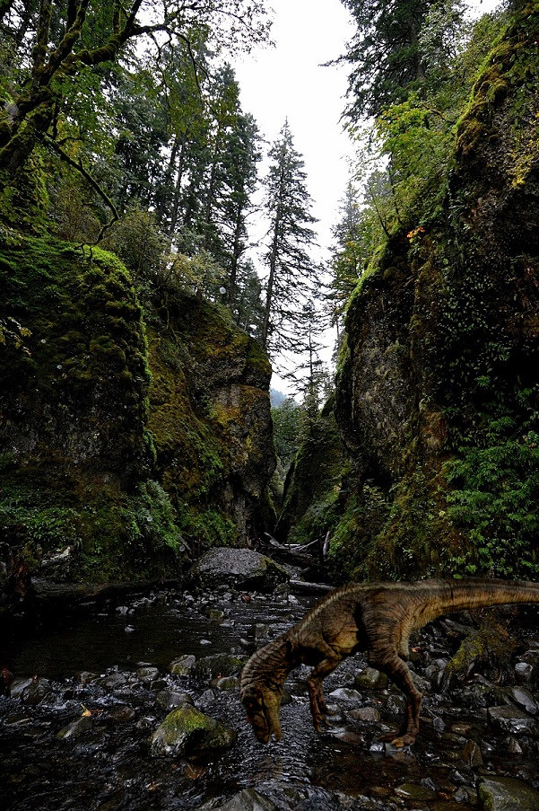 |
|
Abby Normal
Senior Member
Joined: Dec 22, 2010 12:31:49 GMT -5
Posts: 3,501
|
Post by Abby Normal on Sept 30, 2013 13:19:42 GMT -5
#1, 5, 7, 9, & either 10 or 11. I like 10 better for the general colors in the trees & "greenery", but I prefer the water reflections in 11. I'm not sure what part of the country you live in, but am jealous of your beautiful scenery! Nice work! Thanks I live in an area called the Columbia Gorge. It's the border between Oregon and Washington. One half is green forest, the other half is dry desert. I think it's the most beautiful place in the world I like the greenery in 10 as well, just wish I could have had a *little* space between the tree and the cliff for some more sky. I thought I recognized the area. If you've never been down there, take a day trip to the Opal Creek area (east of Salem). You will get some beautiful pictures! |
|
Chocolate Lover
Distinguished Associate
Joined: Dec 17, 2010 15:54:19 GMT -5
Posts: 23,200
|
Post by Chocolate Lover on Sept 30, 2013 13:38:09 GMT -5
Virgil, for about 2 seconds, I thought your dinosaur was a tree root. He may need to be a different color. How about purple? And we'll name him Barney |
|
Virgil Showlion
Distinguished Associate
Moderator
[b]leones potest resistere[/b]
Joined: Dec 20, 2010 15:19:33 GMT -5
Posts: 27,448
|
Post by Virgil Showlion on Sept 30, 2013 15:04:42 GMT -5
Virgil, for about 2 seconds, I thought your dinosaur was a tree root. He may need to be a different color. How about purple? And we'll name him Barney He's rippy the raptor. And he'll win Apple Best of Show. You'll see.  |
|
Apple
Junior Associate
Always travel with a sense of humor
Joined: Dec 17, 2010 15:51:04 GMT -5
Posts: 9,938
Mini-Profile Name Color: dc0e29
|
Post by Apple on Sept 30, 2013 22:12:42 GMT -5
Thanks I live in an area called the Columbia Gorge. It's the border between Oregon and Washington. One half is green forest, the other half is dry desert. I think it's the most beautiful place in the world I like the greenery in 10 as well, just wish I could have had a *little* space between the tree and the cliff for some more sky. I thought I recognized the area. If you've never been down there, take a day trip to the Opal Creek area (east of Salem). You will get some beautiful pictures! Thanks I'll have to check out Opal Creek. Maybe head down next summer and spend a day at the fair, and a day or two on hikes... |
|
Apple
Junior Associate
Always travel with a sense of humor
Joined: Dec 17, 2010 15:51:04 GMT -5
Posts: 9,938
Mini-Profile Name Color: dc0e29
|
Post by Apple on Sept 30, 2013 22:13:31 GMT -5
Virgil, for about 2 seconds, I thought your dinosaur was a tree root. He may need to be a different color. How about purple? And we'll name him Barney He's rippy the raptor. And he'll win Apple Best of Show. You'll see. I LOVE the dinosaur!! Looks perfect in the photo, straight from a movie set |
|
Apple
Junior Associate
Always travel with a sense of humor
Joined: Dec 17, 2010 15:51:04 GMT -5
Posts: 9,938
Mini-Profile Name Color: dc0e29
|
Post by Apple on Sept 30, 2013 22:53:32 GMT -5
So, after further deliberation...
Looks like #1, the framed mountain, with just a sliver taken off the top, not near as cropped as I attempted the first time.
#3, the bridge and tunnel
#6--the gorge, just very slightly darkened so it's not as dark as #4. I really paid close attention to the colors today while driving--it was close to the same light, raining hard again, and the colors were perfect.
#9--I really wasn't sure if this was good enough, but over both boards, several people selected it. I used the first one, just a tiny bit off the top, and no cropping on the sides. I did lose some quality when trying to lower the file size so I could email it (photos come out around 8Mb, I have to drop it all the way down to around 250 kb). I did try to bring back some of the sharpness and detail, but we'll just have to see how well it will look on the big screen.
And, finally, still debating between the two waterfalls. I would use them both, but I want to show more range. #10 (the one with the tree branches at the top), got about 5 more votes on it overall. And, when I look at it, it just seems to "speak" to me a little more.
If I have time at work, I'm going to put the two side-by-side on the monitors and make a final decision. I just want to see them bigger, brighter, and side-by-side.
Thanks so much for the opinions! I probably would not have used #1 looking at it myself, but it drew in enough people that there must be something special about it (maybe it's just because I see this mountain almost every day, it seemed too "normal" to me. But, I do like the way the sun was hitting it and that the clouds looked like smoke.)
|
|


 ~ Friendships Are Warm ~ True Passions are Fire ~


